![]()
Debt to Asset Ratio
Definition
\[DAR = \frac{Total \: Liabilities}{Total \: Assets}\]
Notes: Variables should be equivalent for 990 and EZ filers in the IRS data.
Variables
Total liabilities, EOY
- On 990: Part X, line 26B
- SOI PC EXTRACTS: totliabend
- NCCS Core:
- SOI PC EXTRACTS: totliabend
- On EZ: Part II, line 26B
Denominator: Total assets, EOY
- On 990: Part X, line 16B
- On EZ: Part II, line 25B
Tabulation
# can't divide by zero
zero.these <- core$totassetsend == 0
core$totassetsend[ core$totassetsend == 0 ] <- NA

core$dar <- core$totliabend / core$totassetsend
Standardize Scales
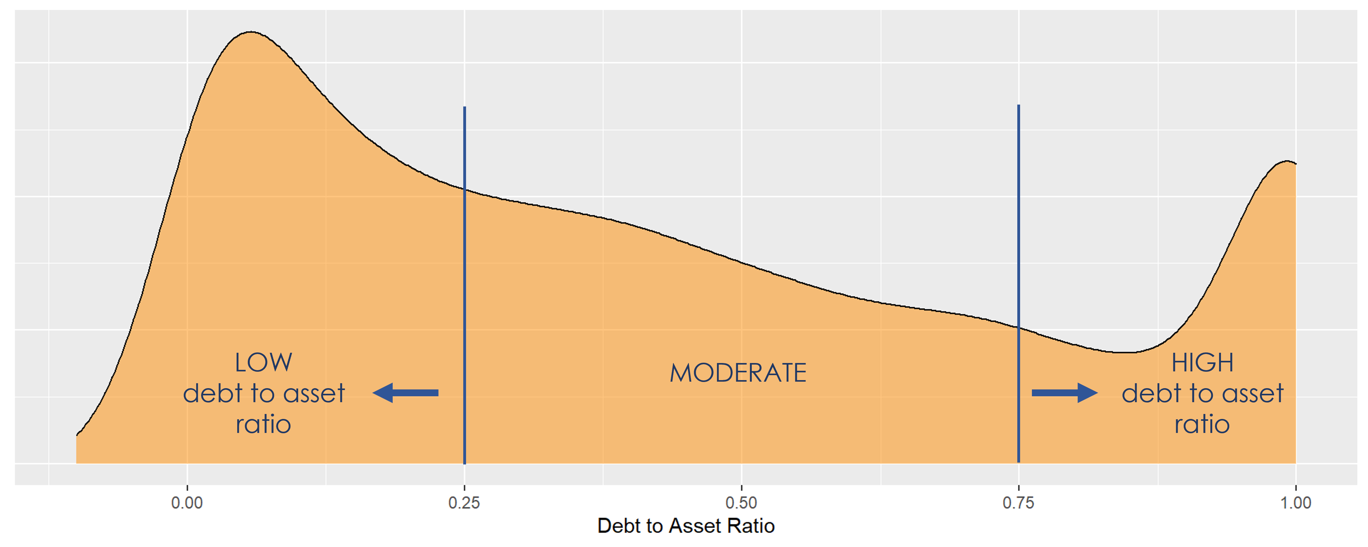
Check high and low values to see what makes sense.
A ratio below 0 is odd because it means assets are negative and liabilities are positive.
A ratio above 1 might be realistic, but not more meaningful than knowing the ratio is at least one, which means the org has liabilities that as as large or larger than assets. Practically, a ratio of 1 or 2 probably mean the same thing for an organization (they are in trouble).
ggplot( core, aes(x = dar )) +
  geom_density( alpha = 0.5, fill="blue" ) +
xlim( -1, 2 ) 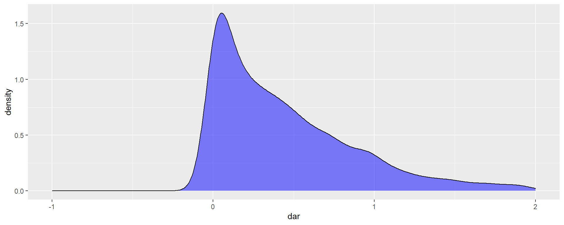
core$dar[ core$dar < 0 ] <- 0
core$dar[ core$dar >  1 ] <-  1
Metric Scope
Score describes whether the metric applies to all 990 filers, or only the full 990 filers (if the variable is not included on the 990-EZ form).
Tax data is available for both full 990 and 990-EZ filers, so this metric describes all orgs.
Scope codes:
- PZ: Both 990 and 990-EZ filers
- PC: Only full 990 (public charity or PC) filers only
- EZ: Only 990-EZ filers
Descriptive Statistics
Put Debt to Asset Ratio on a scale of -10,000 to +20,000.
Convert everything else to thousands of dollars.
# rescale DAR where 1 = 10,000

core %>%
  mutate( dar = dar * 10000,
    totrevenue = totrevenue / 1000,
    totfuncexpns = totfuncexpns / 1000,
    lndbldgsequipend = lndbldgsequipend / 1000,
    totassetsend = totassetsend / 1000,
    totliabend = totliabend / 1000,
    totnetassetend = totnetassetend / 1000 ) %>%
  select( STATE, AGE, NTEE1, NTMAJ12,
          dar, totrevenue, totfuncexpns, lndbldgsequipend,
          totassetsend, totliabend, totnetassetend   ) %>%

  stargazer( type = s.type,
             digits=0,
             summary.stat = c("min","p25","median",
"mean","p75","max", "sd") )| Statistic | Min | Pctl(25) | Median | Mean | Pctl(75) | Max | St. Dev. |
| AGE | 3 | 22 | 30 | 32 | 41 | 95 | 15 |
| dar | 0 | 996 | 3,466 | 4,226 | 7,188 | 10,000 | 3,518 |
| totrevenue | -5,377 | 259 | 909 | 4,522 | 3,672 | 408,932 | 14,286 |
| totfuncexpns | 0 | 263 | 840 | 4,192 | 3,328 | 382,667 | 13,466 |
| lndbldgsequipend | -4 | 79 | 824 | 3,504 | 2,868 | 513,509 | 13,210 |
| totassetsend | -7,552 | 788 | 2,459 | 9,292 | 7,492 | 672,021 | 27,078 |
| totliabend | -2,707 | 115 | 816 | 4,709 | 3,133 | 705,623 | 18,722 |
| totnetassetend | -178,870 | 156 | 1,094 | 4,553 | 4,079 | 531,068 | 15,470 |
What proportion of orgs have a DAR of zero (no outstanding liabilities)?
prop.zero <- mean( core$dar == 0, na.rm=T )In the sample, 5 percent of the organizations have a DAR of zero, meaning they carried no debt. These organizations are dropped from subsequent graphs to keep the visualizations clean. The interpretation of the graphics should be the distributions of Debt to Asset Ratio for organizations that carry debt.
Filter out cases with DAR=0 because they dominate the graphics otherwise.
# drop cases where DAR=0
core2 <-  core
core2$dar[ core2$dar == 0 ] <- NA
Create quantile groups:
###
### ADD QUANTILES
###
###   function create_quantiles() defined in r-functions.R

core2$exp.q   <- create_quantiles( var=core2$totfuncexpns,   n.groups=5 )
core2$rev.q   <- create_quantiles( var=core2$totrevenue,     n.groups=5 )
core2$asset.q <- create_quantiles( var=core2$totnetassetend, n.groups=5 )
core2$age.q   <- create_quantiles( var=core2$AGE,            n.groups=5 )
core2$land.q  <- create_quantiles( var=core2$lndbldgsequipend, n.groups=5 )
DAR Density
ggplot( core2, aes(x = dar )) +
  geom_density( alpha = 0.5, fill="darkorange" ) +
  xlim( -0.1, 1 ) +
  xlab( variable.label ) +
  theme( axis.title.y=element_blank(),
         axis.text.y=element_blank(),
         axis.ticks.y=element_blank() )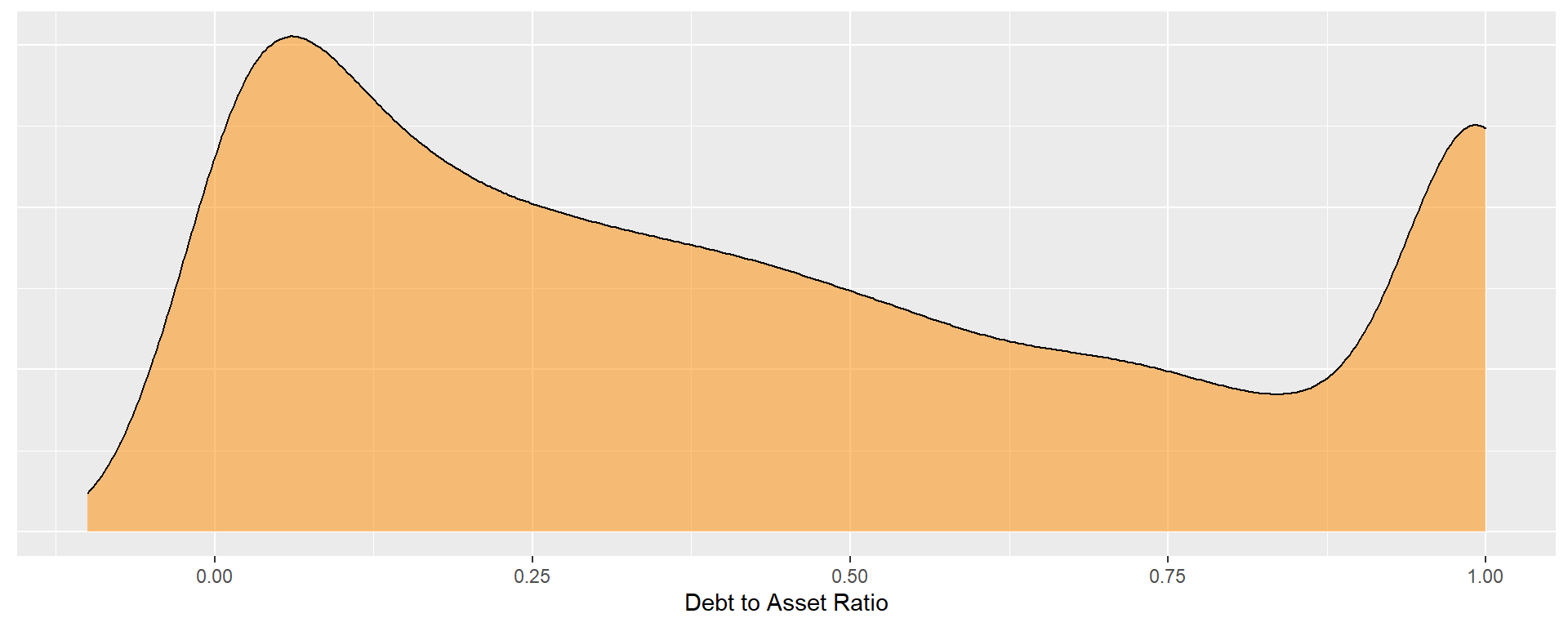
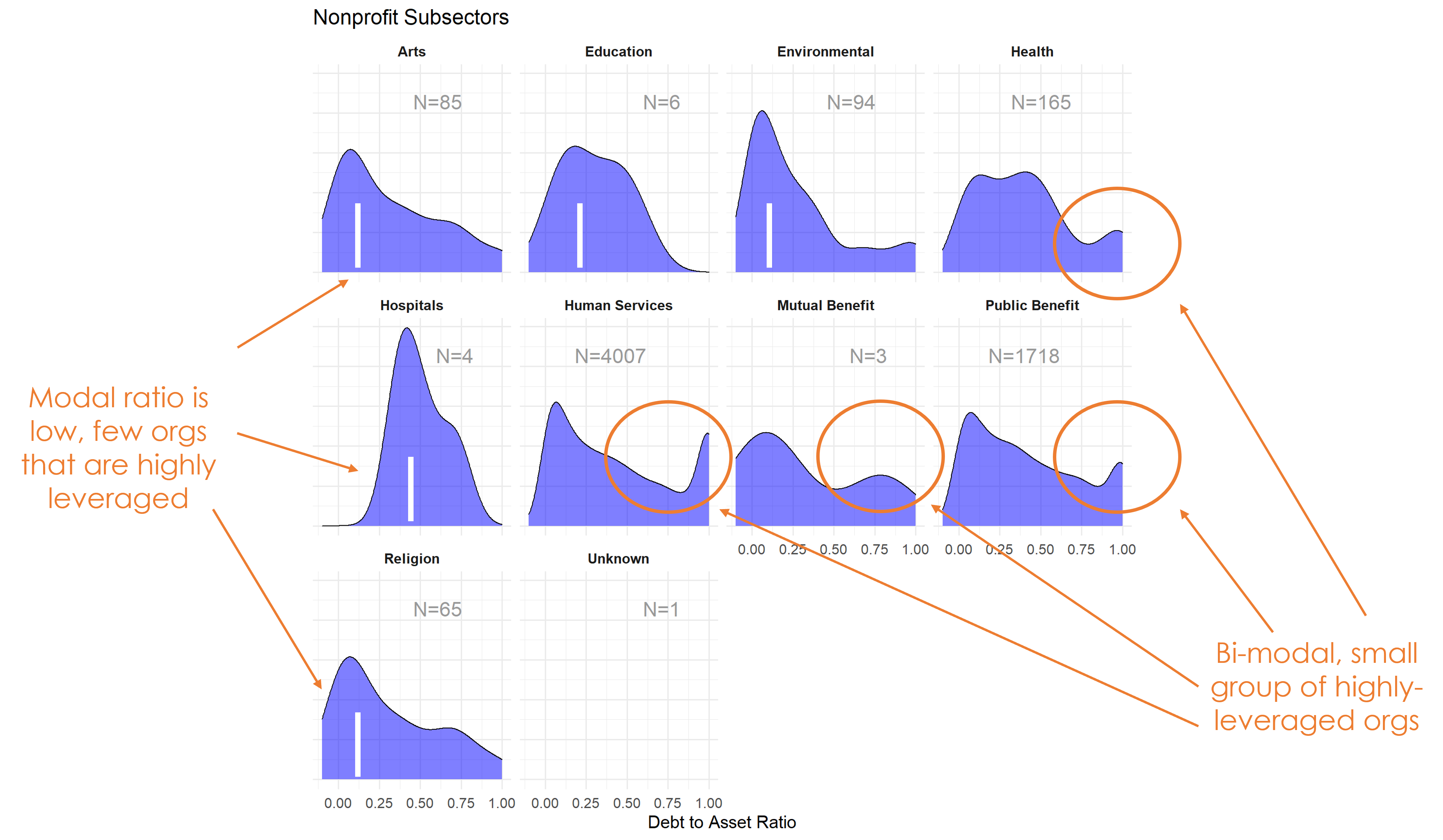
DAR by NTEE Major Code
core3 <- core2 %>% filter( ! is.na(NTEE1) )
table( core3$NTEE1) %>% sort(decreasing=TRUE) %>% kable()| Var1 | Freq |
|---|---|
| Housing | 2837 |
| Community Development | 1585 |
| Human Services | 1102 |
t <- table( factor(core3$NTEE1) )
df <- data.frame( x=Inf, y=Inf,
                  N=paste0( "N=", as.character(t) ),
                  NTEE1=names(t) )

ggplot( core3, aes( x=dar ) ) +
  geom_density( alpha = 0.5, fill="blue" ) +
  xlim( -0.1, 1 ) +
  labs( title="Nonprofit Subsectors" ) +
  xlab( variable.label ) +
  facet_wrap( ~ NTEE1, nrow=1 ) +
    theme_minimal( base_size = 15 )  +
    theme( axis.title.y=element_blank(),
           axis.text.y=element_blank(),
           axis.ticks.y=element_blank(),
           strip.text = element_text( face="bold") ) +  # size=20
  geom_text( data=df,
             aes(x, y, label=N ),
             hjust=2, vjust=3,
             color="gray60", size=6 )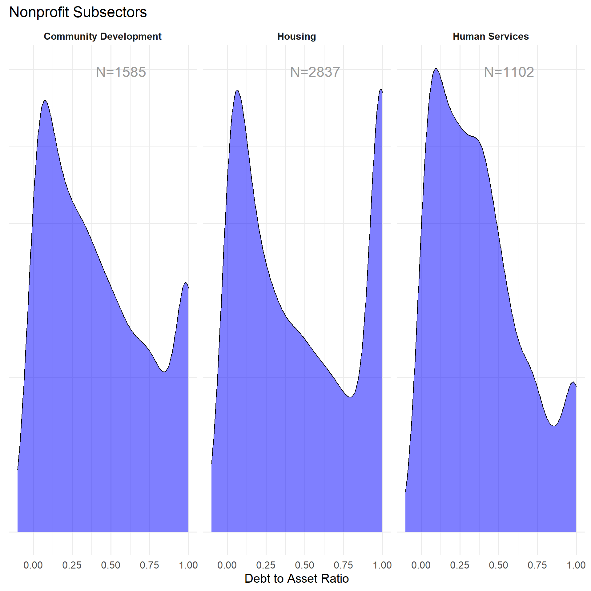
DAR by Region
table( core$Region) %>% kable()| Var1 | Freq |
|---|---|
| Midwest | 1444 |
| Northeast | 1368 |
| South | 1610 |
| West | 1088 |
t <- table( factor(core3$Region) )
df <- data.frame( x=Inf, y=Inf,
                  N=paste0( "N=", as.character(t) ),
                  Region=names(t) )

core2 %>%
  filter( ! is.na(Region) ) %>%
  ggplot( aes(dar) )  +
    geom_density( alpha = 0.5, fill="blue" ) +
    xlab( "Census Regions" ) +
    ylab( variable.label ) +
    facet_wrap( ~ Region, nrow=3 ) +
    theme_minimal( base_size = 22 )  +
    theme( axis.title.y=element_blank(),
           axis.text.y=element_blank(),
           axis.ticks.y=element_blank() ) +
    geom_text( data=df,
             aes(x, y, label=N ),
             hjust=2, vjust=3,
             color="gray60", size=6 )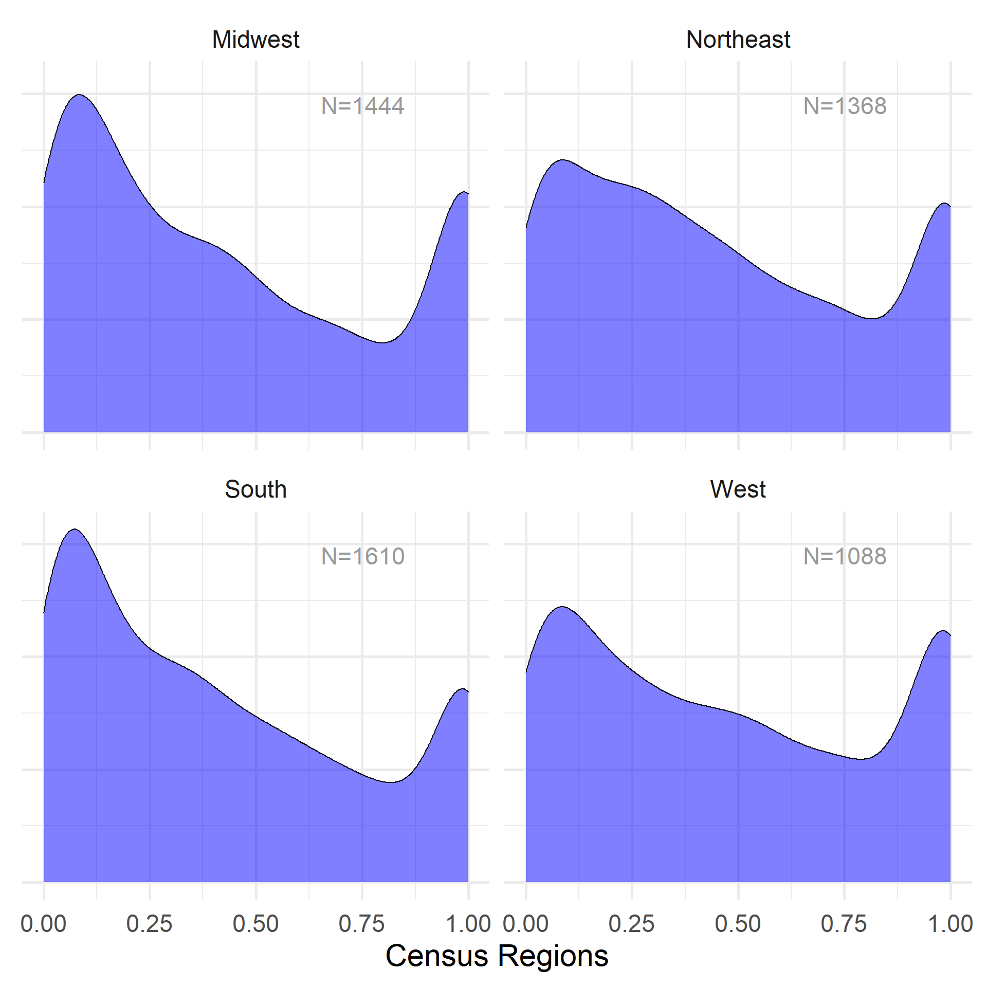
table( core$Division ) %>% kable()| Var1 | Freq |
|---|---|
| East North Central | 1038 |
| East South Central | 289 |
| Middle Atlantic | 904 |
| Mountain | 303 |
| New England | 464 |
| Pacific | 785 |
| South Atlantic | 900 |
| West North Central | 406 |
| West South Central | 421 |
t <- table( factor(core3$Division) )
df <- data.frame( x=Inf, y=Inf,
                  N=paste0( "N=", as.character(t) ),
                  Division=names(t) )

core2 %>%
  filter( ! is.na(Division) ) %>%
  ggplot( aes(dar) )  +
    geom_density( alpha = 0.5, fill="blue" ) +
    xlab( "Census Sub-Regions (10)" ) +
    ylab( variable.label ) +
    facet_wrap( ~ Division, nrow=3 ) +
    theme_minimal( base_size = 22 )  +
    theme( axis.title.y=element_blank(),
           axis.text.y=element_blank(),
           axis.ticks.y=element_blank() ) +
    geom_text( data=df,
             aes(x, y, label=N ),
             hjust=2, vjust=3,
color="gray60", size=6 ) 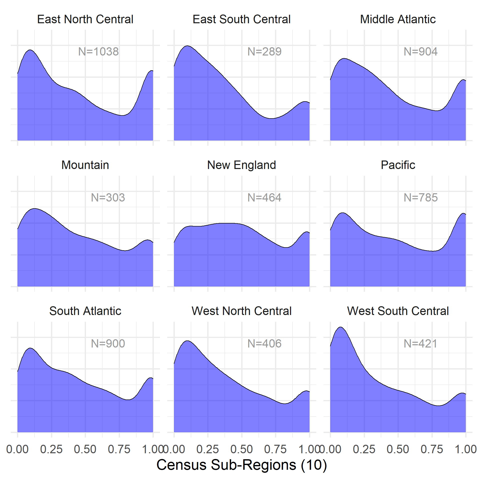
DAR by Nonprofit Size (Expenses)
ggplot( core2, aes(x = totfuncexpns )) +
  geom_density( alpha = 0.5, fill="darkorange" ) +
  xlim( quantile(core2$totfuncexpns, c(0.02,0.98), na.rm=T ) )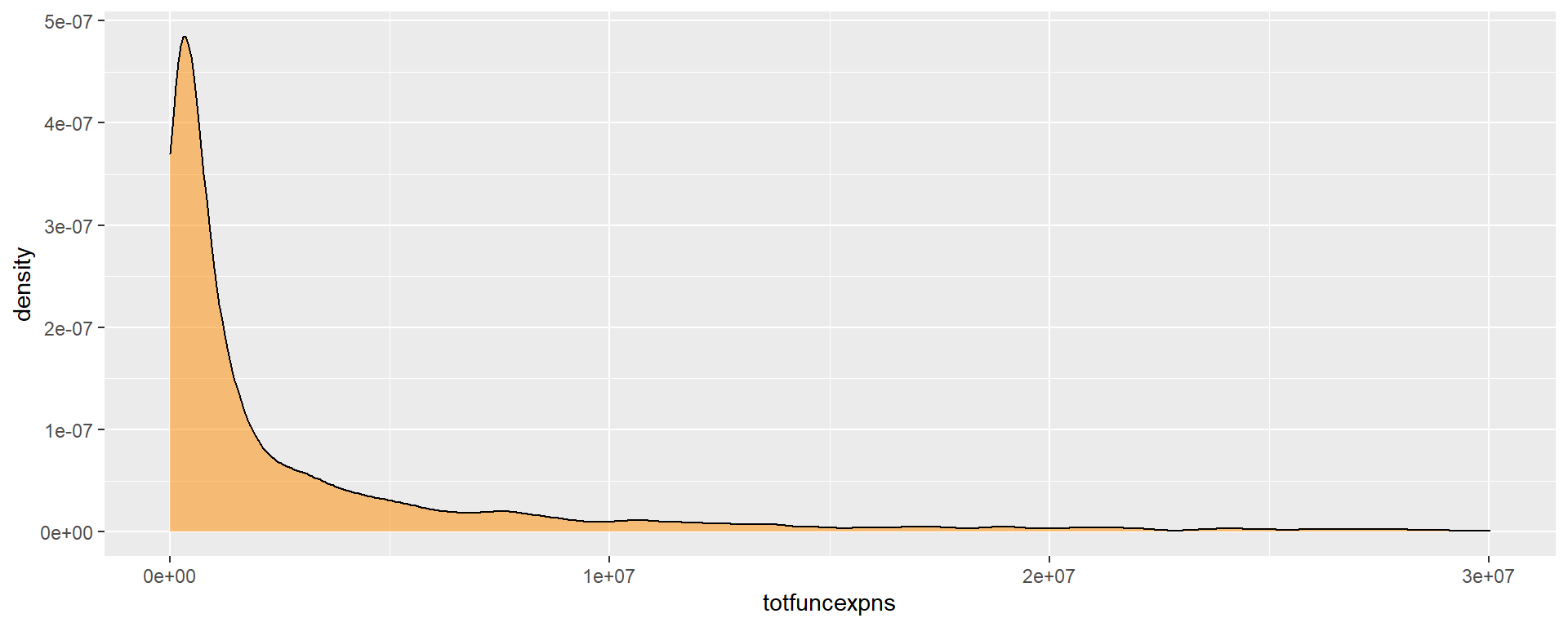
core2$totfuncexpns[ core2$totfuncexpns < 1 ] <- 1
# core2$totfuncexpns[ is.na(core2$totfuncexpns) ] <- 1

if( nrow(core2) > 10000 )
{
  core3 <- sample_n( core2, 10000 )
} else
{
  core3 <- core2
}

jplot( log10(core3$totfuncexpns), core3$dar,
       xlab="Nonprofit Size (logged Expenses)",
       ylab=variable.label,
       xaxt="n", xlim=c(3,10) )
axis( side=1,
      at=c(3,4,5,6,7,8,9,10),
      labels=c("1k","10k","100k","1m","10m","100m","1b","10b") )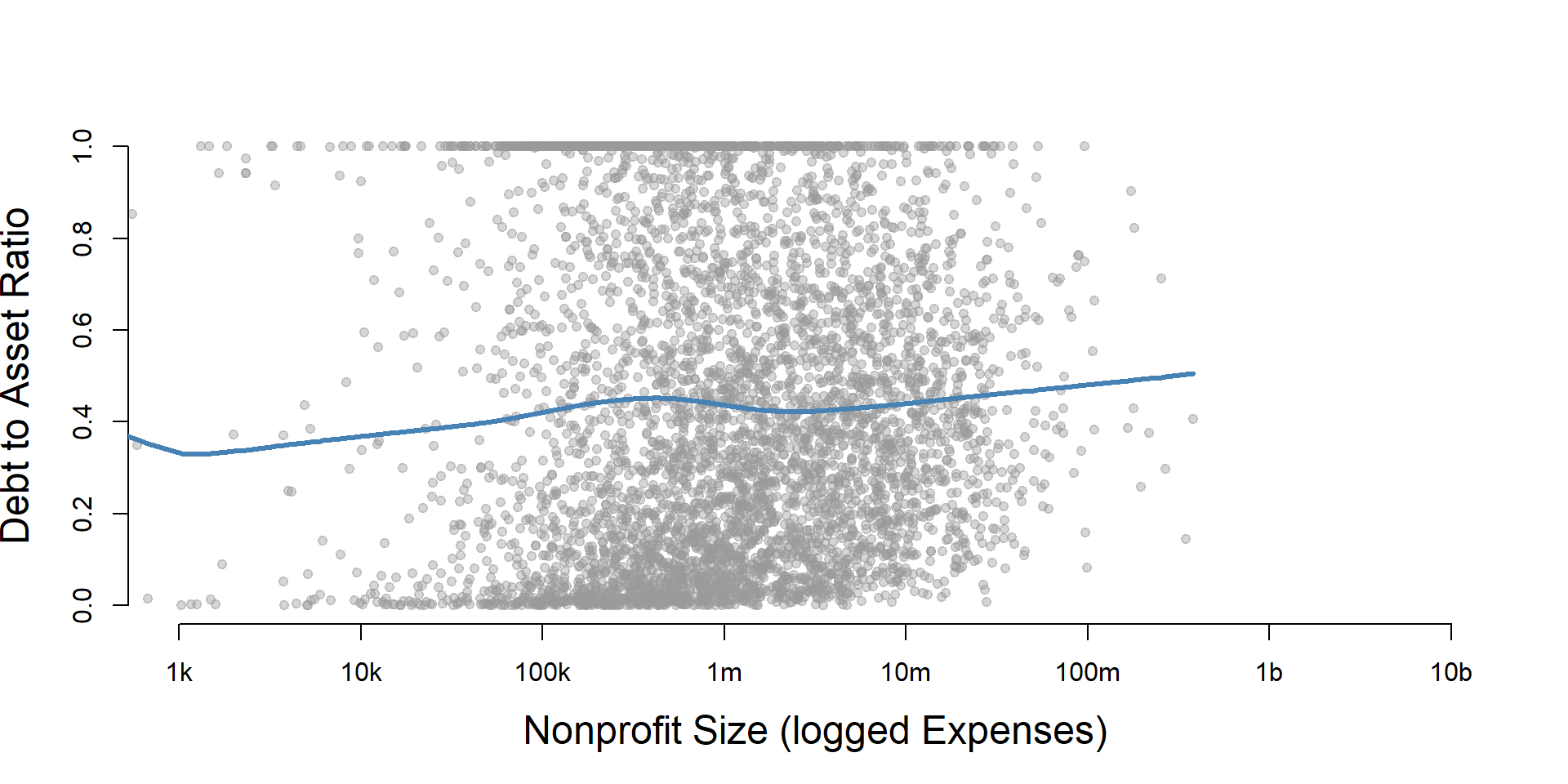
core2 %>%
  filter( ! is.na(exp.q) ) %>%
  ggplot( aes(dar) )  +
    geom_density( alpha = 0.5, fill="blue" ) +
    labs( title="Nonprofit Size (logged expenses)" ) +
    xlab( variable.label ) +
    facet_wrap( ~ exp.q, nrow=3 ) +
    theme_minimal( base_size = 22 )  +
    theme( axis.title.y=element_blank(),
           axis.text.y=element_blank(),
           axis.ticks.y=element_blank() )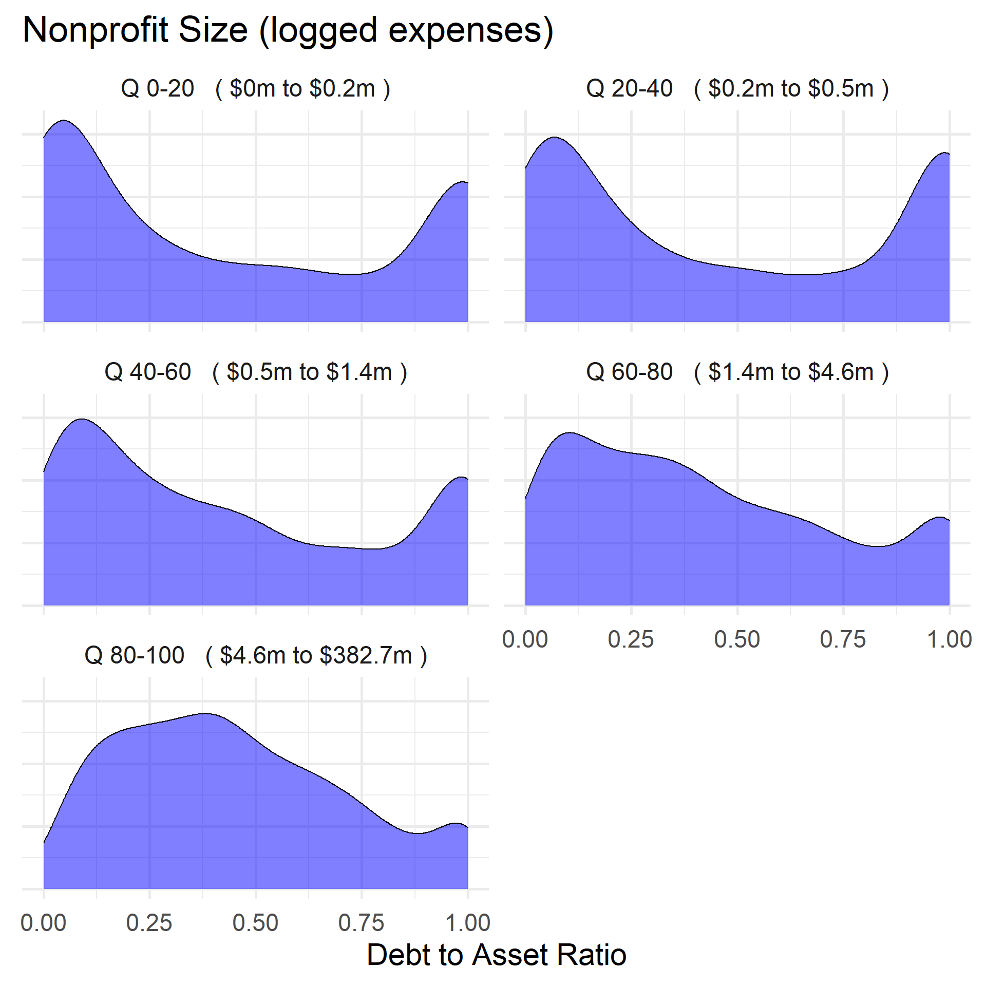
DAR by Nonprofit Size (Revenue)
ggplot( core2, aes(x = totrevenue )) +
  geom_density( alpha = 0.5, fill="darkorange" ) +
  xlim( quantile(core2$totrevenue, c(0.02,0.98), na.rm=T ) ) +
  theme( axis.title.y=element_blank(),
           axis.text.y=element_blank(),
           axis.ticks.y=element_blank() )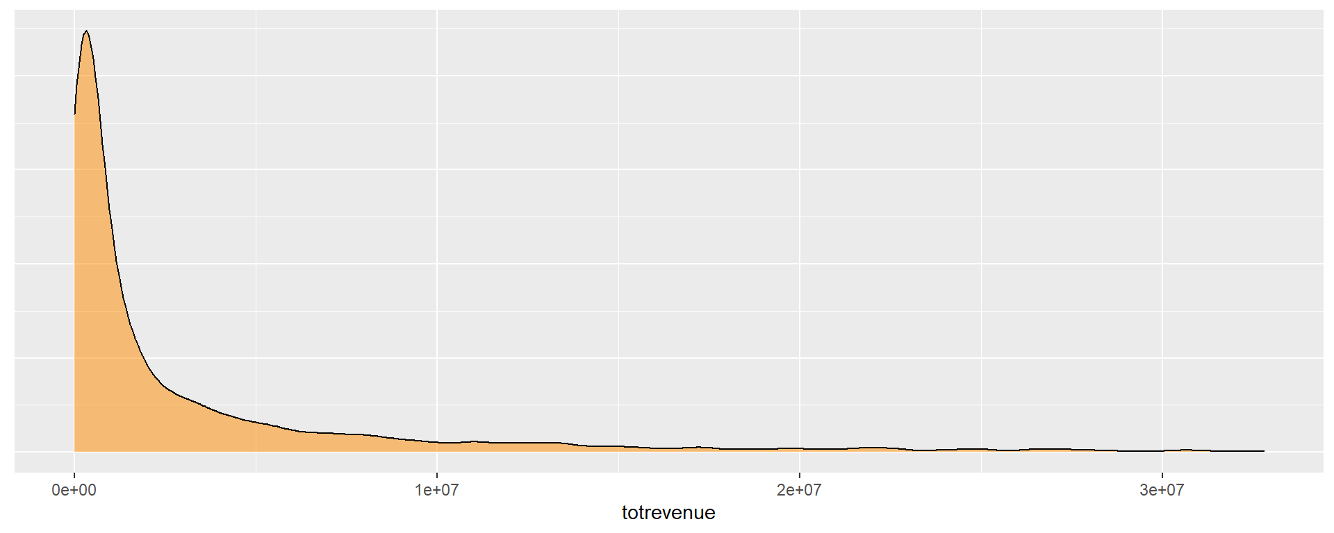
core2$totrevenue[ core2$totrevenue < 1 ] <- 1

if( nrow(core2) > 10000 )
{
  core3 <- sample_n( core2, 10000 )
} else
{
  core3 <- core2
}

jplot( log10(core3$totrevenue), core3$dar,
       xlab="Nonprofit Size (logged Revenue)",
       ylab=variable.label,
       xaxt="n", xlim=c(3,10) )
axis( side=1,
      at=c(3,4,5,6,7,8,9,10),
      labels=c("1k","10k","100k","1m","10m","100m","1b","10b") )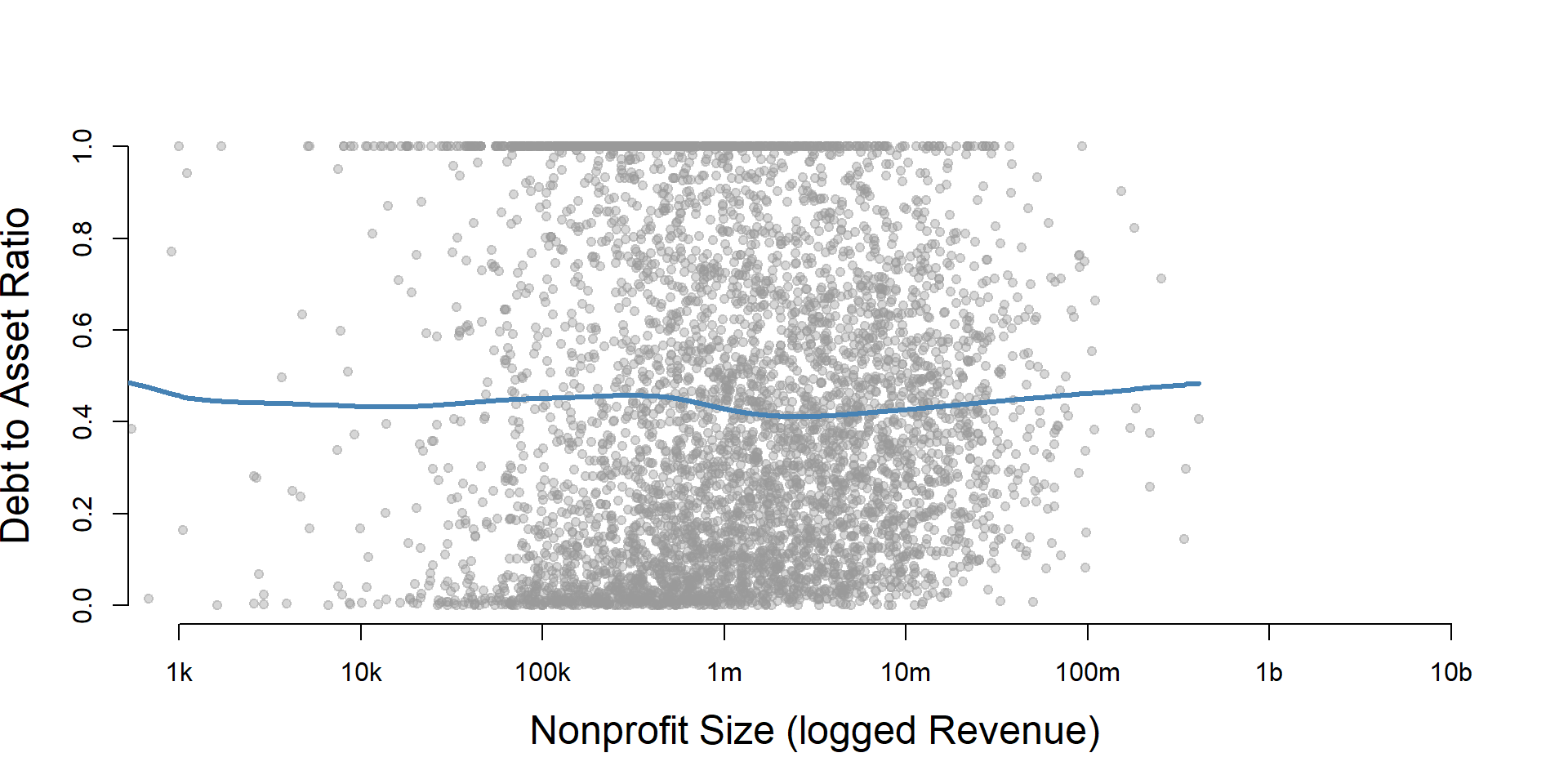
core2 %>%
  filter( ! is.na(rev.q) ) %>%
  ggplot( aes(dar) )  +
    geom_density( alpha = 0.5, fill="blue" ) +
    labs( title="Nonprofit Size (logged revenues)" ) +
    xlab( variable.label ) +
    facet_wrap( ~ rev.q, nrow=3 ) +
    theme_minimal( base_size = 22 )  +
    theme( axis.title.y=element_blank(),
           axis.text.y=element_blank(),
           axis.ticks.y=element_blank() )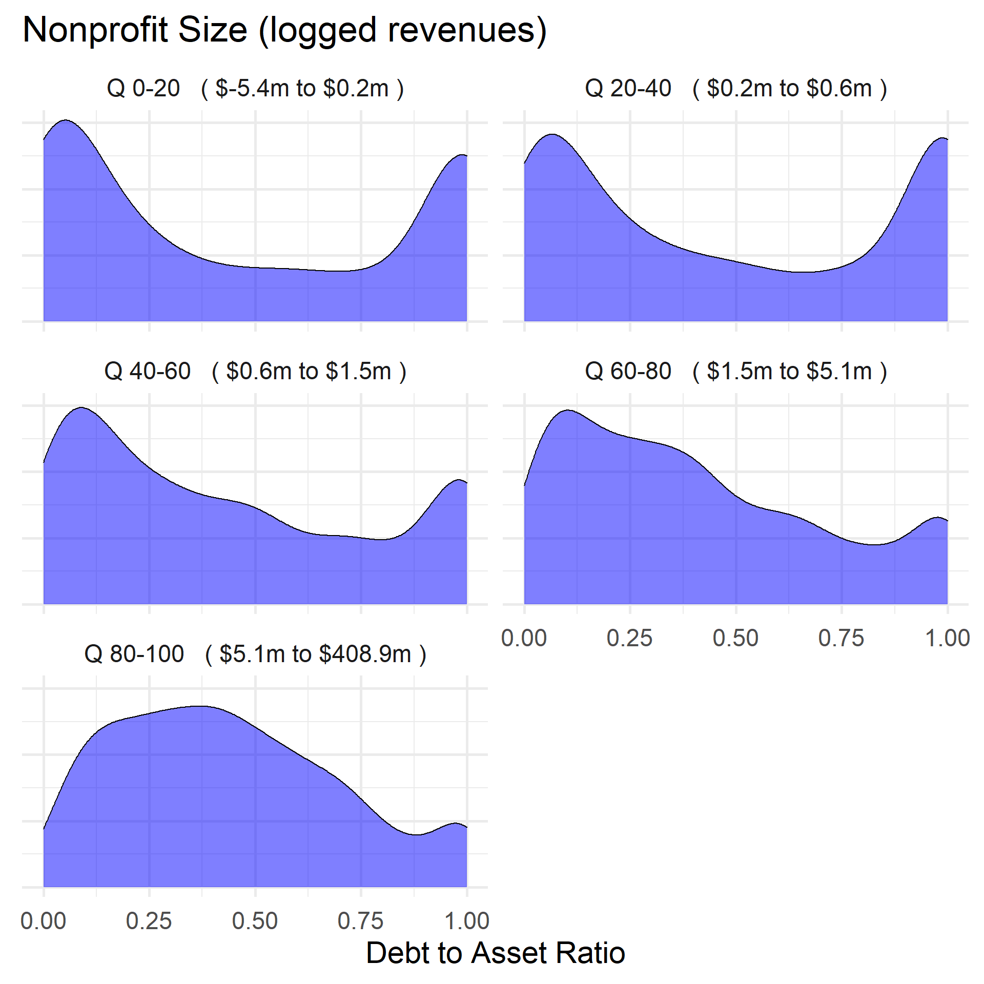
DAR by Nonprofit Size (Net Assets)
ggplot( core2, aes(x = totnetassetend )) +
  geom_density( alpha = 0.5, fill="darkorange" ) +
  xlim( quantile(core2$totnetassetend, c(0.02,0.98), na.rm=T ) ) +
  xlab( "Net Assets" ) +
    theme( axis.title.y=element_blank(),
           axis.text.y=element_blank(),
           axis.ticks.y=element_blank() )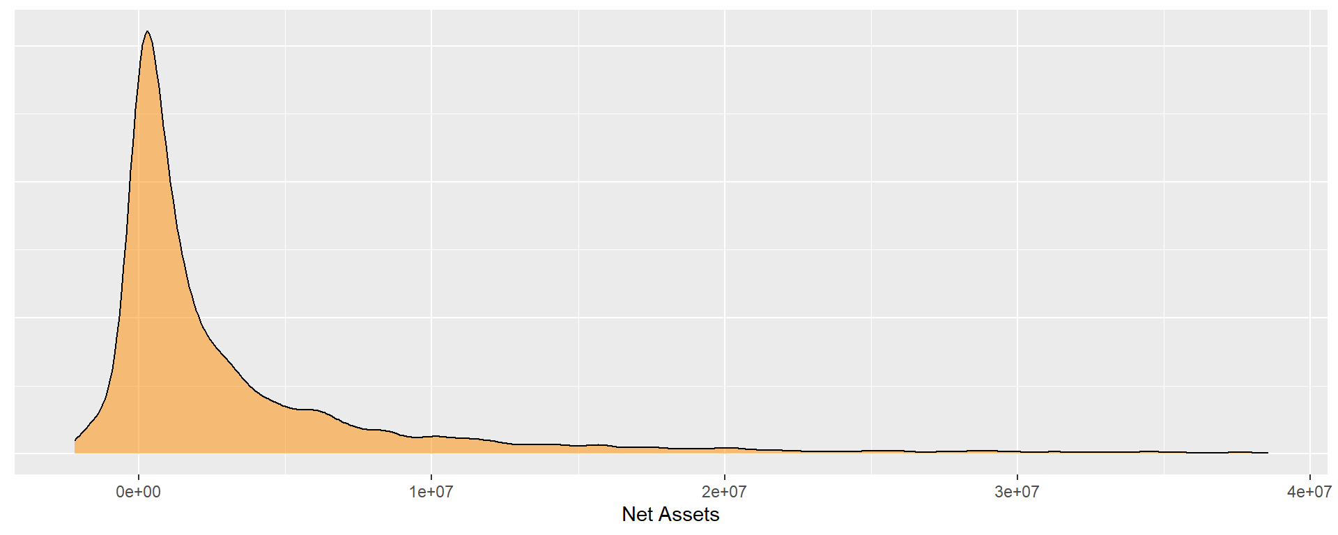
core2$totnetassetend[ core2$totnetassetend < 1 ] <- NA

if( nrow(core2) > 10000 )
{
  core3 <- sample_n( core2, 10000 )
} else
{
  core3 <- core2
}

jplot( log10(core3$totnetassetend), core3$dar,
       xlab="Nonprofit Size (logged Net Assets)",
       ylab=variable.label,
       xaxt="n", xlim=c(3,10) )
axis( side=1,
      at=c(3,4,5,6,7,8,9,10),
      labels=c("1k","10k","100k","1m","10m","100m","1b","10b") )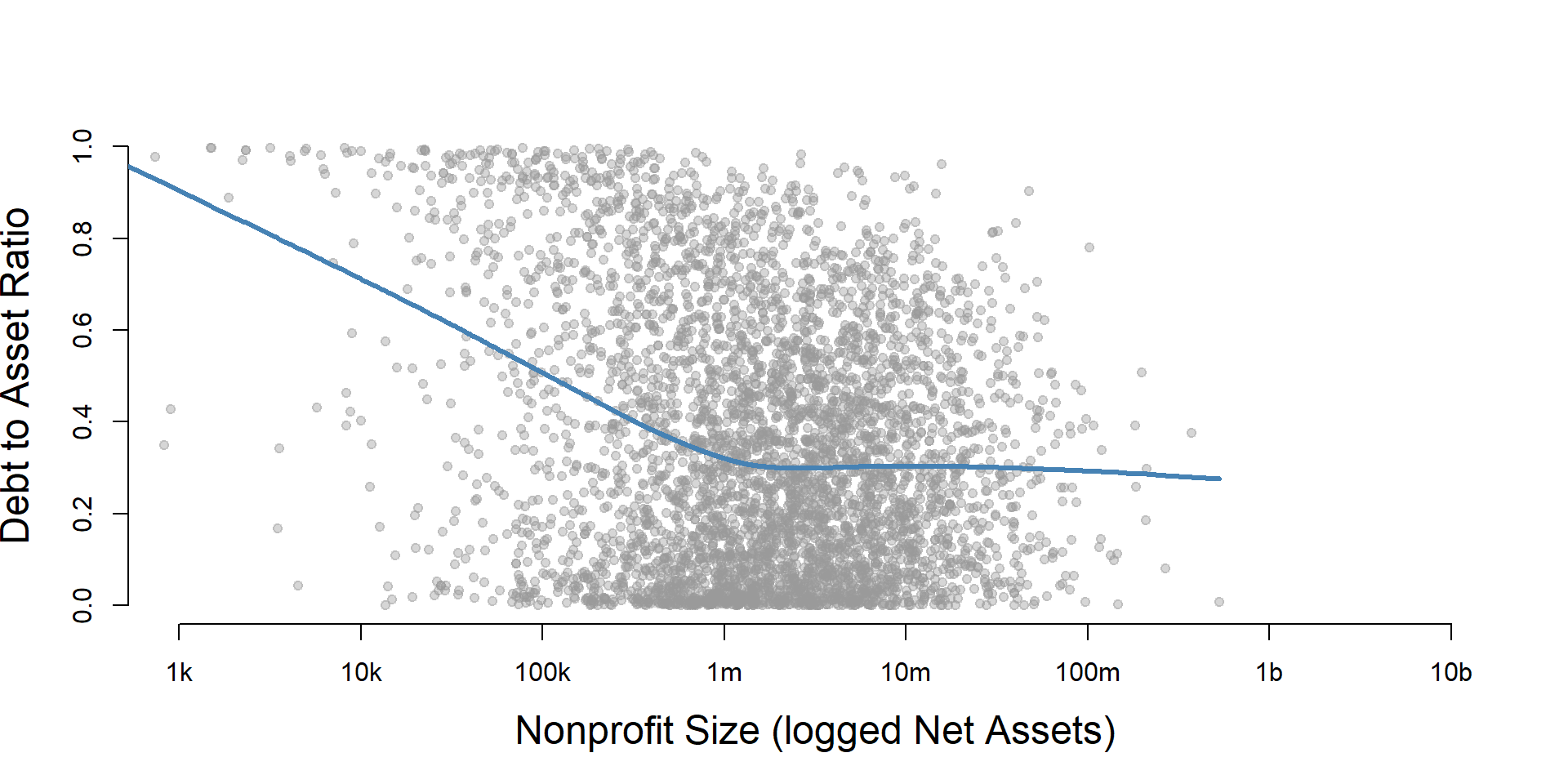
core2$totnetassetend[ core2$totnetassetend < 1 ] <- NA
core2$asset.q <- create_quantiles( var=core2$totnetassetend, n.groups=5 )

core2 %>%
  filter( ! is.na(asset.q) ) %>%
  ggplot( aes(dar) )  +
    geom_density( alpha = 0.5, fill="blue" ) +
    labs( title="Nonprofit Size (logged net assets, if assets > 0)" ) +
    xlab( variable.label ) +
    ylab( "" ) +
    facet_wrap( ~ asset.q, nrow=3 ) +
    theme_minimal( base_size = 22 )  +
    theme( axis.title.y=element_blank(),
           axis.text.y=element_blank(),
           axis.ticks.y=element_blank() )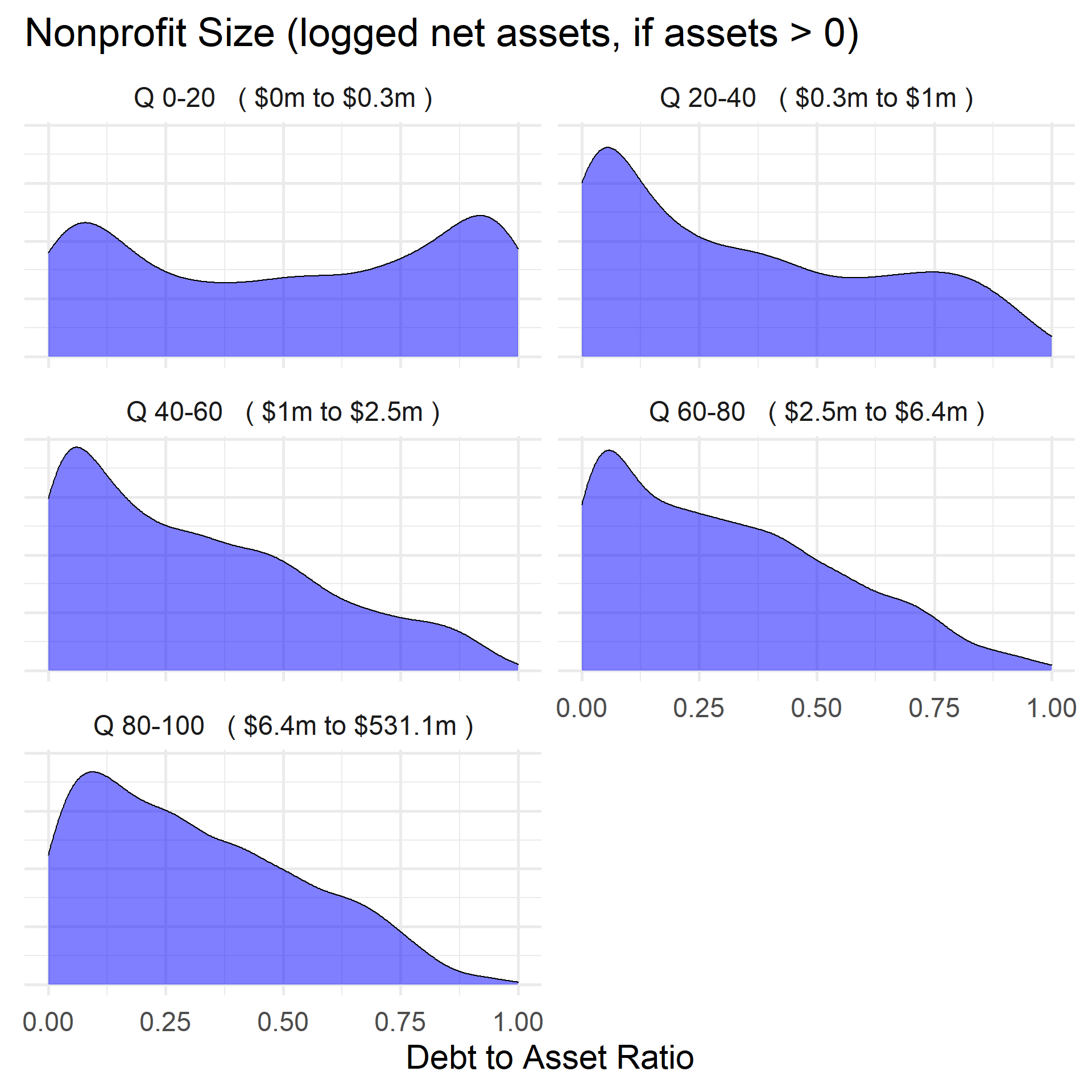
Total Assets for Comparison
core2$totassetsend[ core2$totassetsend < 1 ] <- NA
core2$tot.asset.q <- create_quantiles( var=core2$totassetsend, n.groups=5 )

if( nrow(core2) > 10000 )
{
  core3 <- sample_n( core2, 10000 )
} else
{
  core3 <- core2
}

jplot( log10(core3$totassetsend), core3$dar,
       xlab="Nonprofit Size (logged Total Assets)",
       ylab=variable.label,
       xaxt="n", xlim=c(3,10) )
axis( side=1,
      at=c(3,4,5,6,7,8,9,10),
      labels=c("1k","10k","100k","1m","10m","100m","1b","10b") )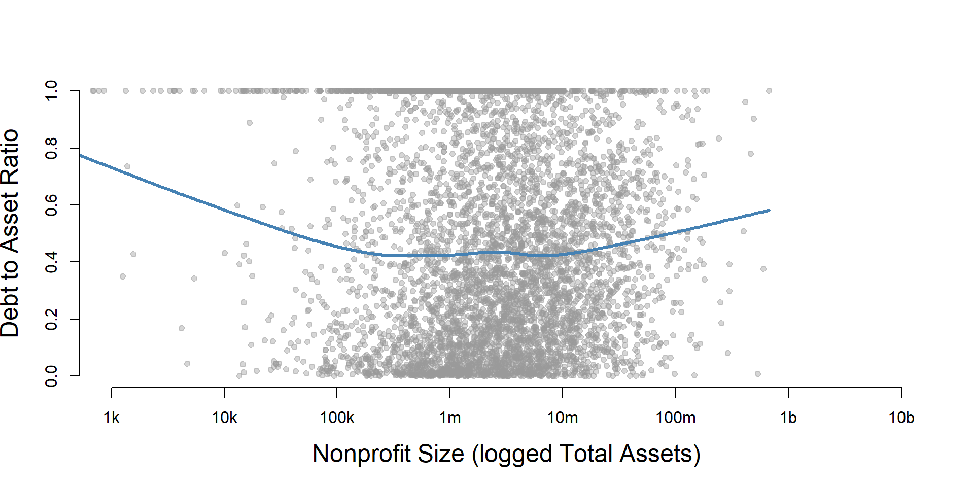
ggplot( core2, aes(x = totassetsend )) +
  geom_density( alpha = 0.5, fill="darkorange" ) +
  xlim( quantile(core2$totassetsend, c(0.02,0.98), na.rm=T ) ) +
  xlab( "Net Assets" ) +
    theme( axis.title.y=element_blank(),
           axis.text.y=element_blank(),
           axis.ticks.y=element_blank() )
core2 %>%
  filter( ! is.na(tot.asset.q) ) %>%
  ggplot( aes(dar) )  +
    geom_density( alpha = 0.5, fill="blue" ) +
    xlab( "Nonprofit Size (logged total assets, if assets > 0)" ) +
    ylab( variable.label ) +
    facet_wrap( ~ tot.asset.q, nrow=3 ) +
    theme_minimal( base_size = 22 )  +
    theme( axis.title.y=element_blank(),
           axis.text.y=element_blank(),
           axis.ticks.y=element_blank() )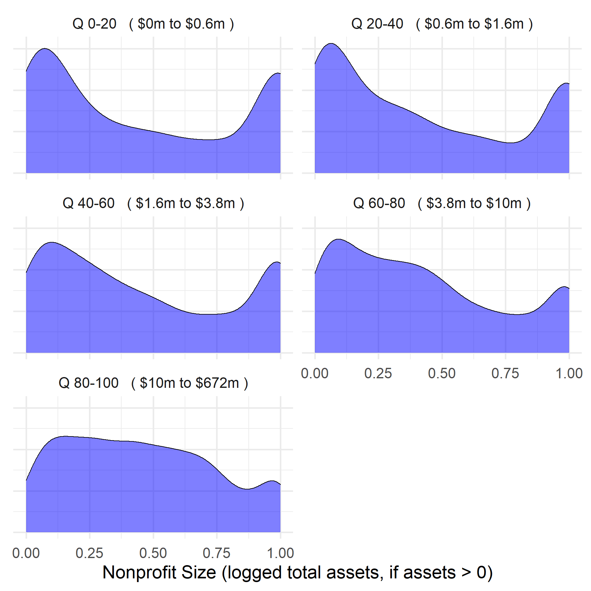
DAR by Nonprofit Age
ggplot( core2, aes(x = AGE )) +
geom_density( alpha = 0.5, fill="darkorange" ) 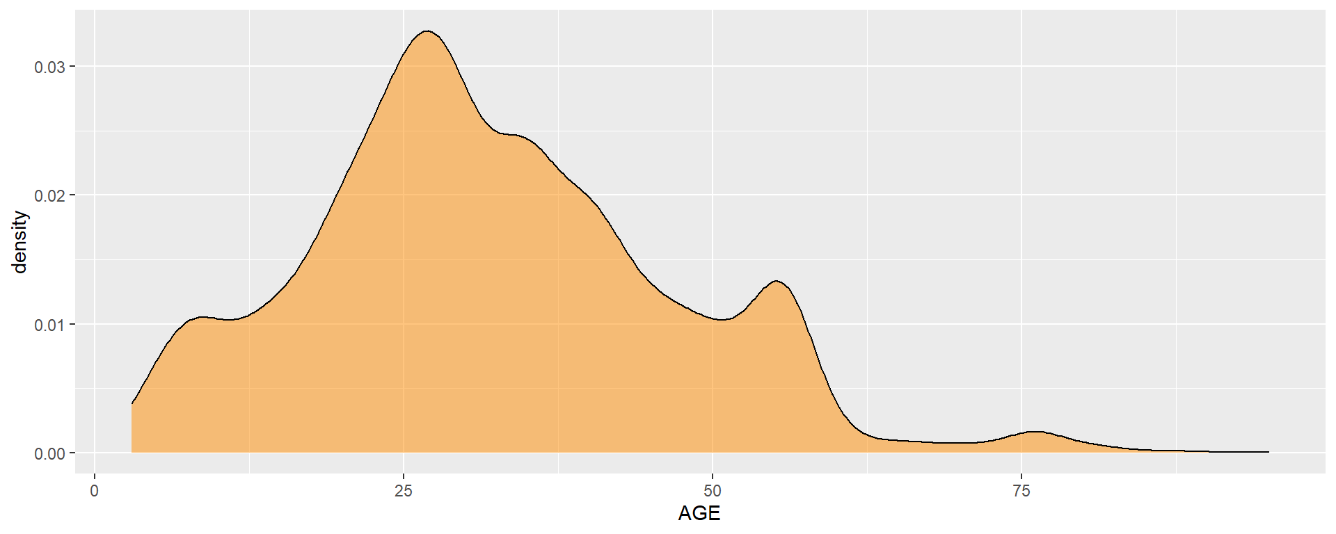
core2$AGE[ core2$AGE < 1 ] <- NA

if( nrow(core2) > 10000 )
{
  core3 <- sample_n( core2, 10000 )
} else
{
  core3 <- core2
}

jplot( core3$AGE, core3$dar,
       xlab="Nonprofit Age",
ylab=variable.label ) 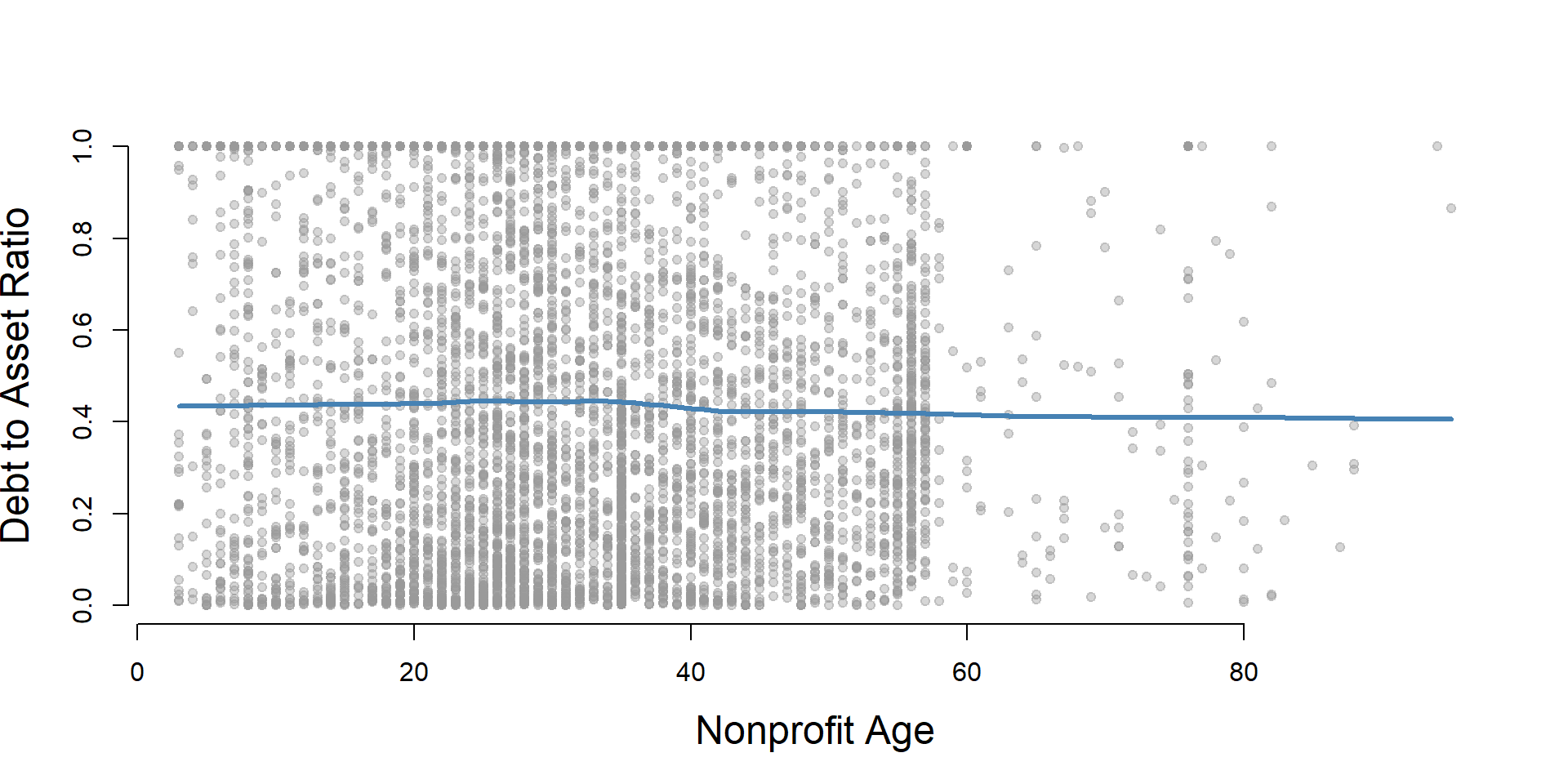
core2 %>%
  filter( ! is.na(age.q) ) %>%
  ggplot( aes(dar) )  +
    geom_density( alpha = 0.5, fill="blue" ) +
    labs( title="Nonprofit Age" ) +
    xlab( variable.label ) +
    ylab( "" ) +
    facet_wrap( ~ age.q, nrow=3 ) +
    theme_minimal( base_size = 22 )  +
    theme( axis.title.y=element_blank(),
           axis.text.y=element_blank(),
           axis.ticks.y=element_blank() )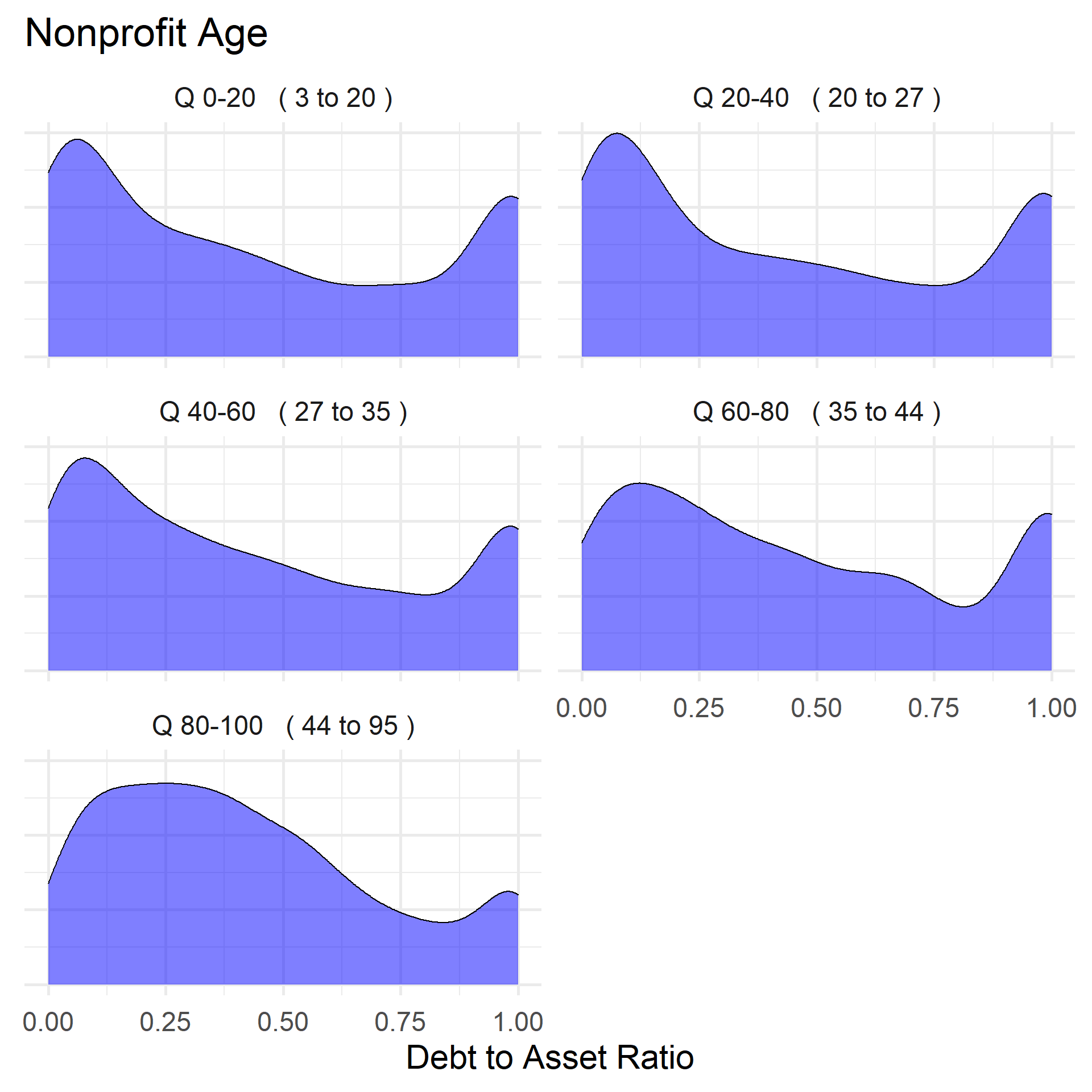
DAR by Land and Building Value
ggplot( core2, aes(x = lndbldgsequipend )) +
geom_density( alpha = 0.5 ) 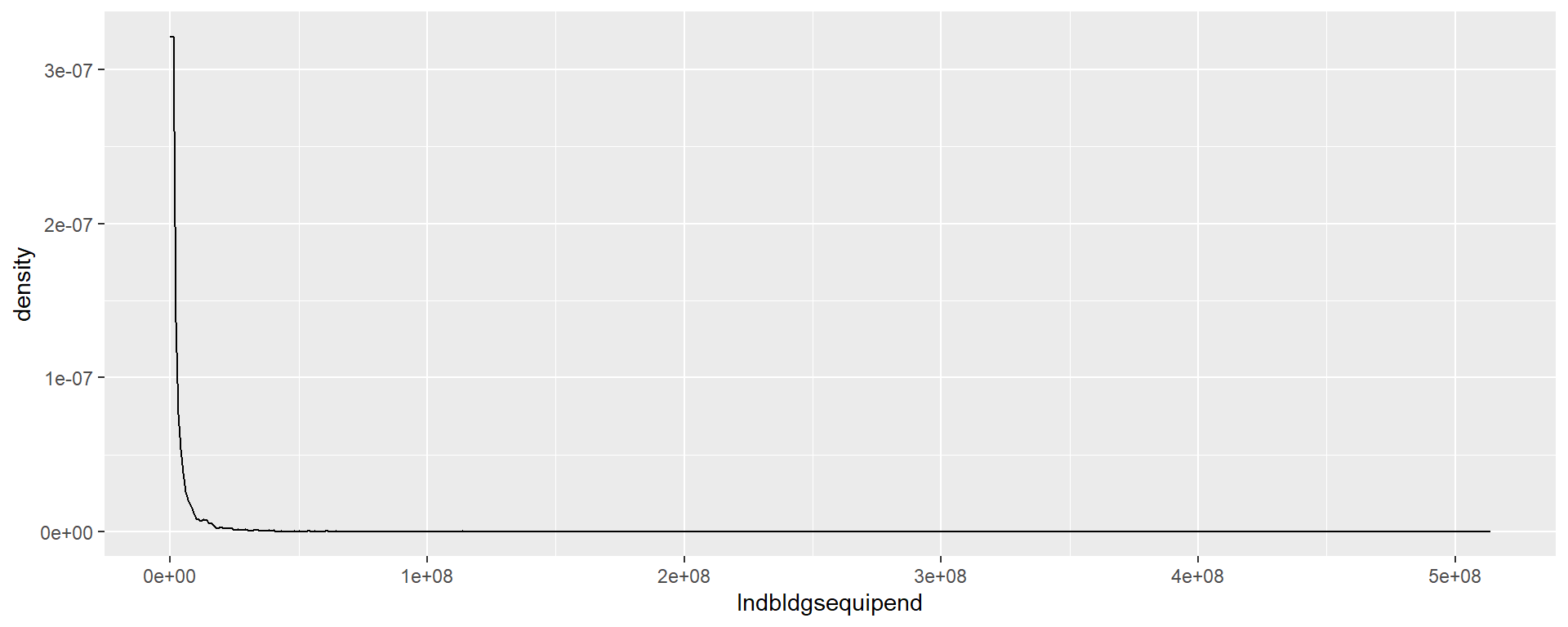
core2$lndbldgsequipend[ core2$lndbldgsequipend < 1 ] <- NA
if( nrow(core2) > 10000 )
{
core3 <- sample_n( core2, 10000 )
} else
{
core3 <- core2
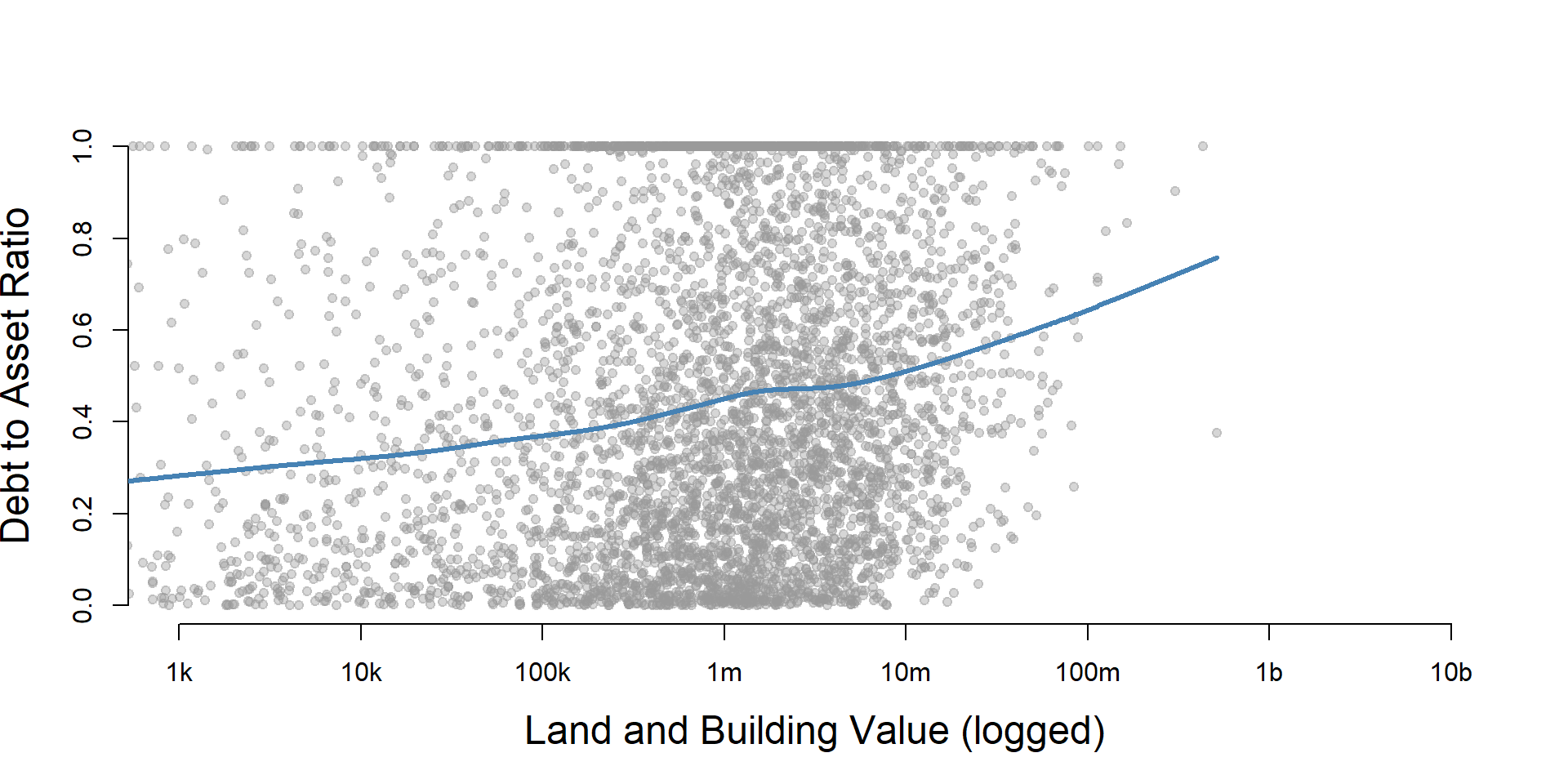
jplot( log10(core3$lndbldgsequipend), core3$dar,
xlab="Land and Building Value (logged)",
ylab=variable.label,
xaxt="n", xlim=c(3,10) )
axis( side=1,
at=c(3,4,5,6,7,8,9,10),
labels=c("1k","10k","100k","1m","10m","100m","1b","10b") )
}
core2 %>%
  filter( ! is.na(land.q) ) %>%
  ggplot( aes(dar) )  +
    geom_density( alpha = 0.5 ) +
    labs( title="Land and Building Value" ) +
    xlab( variable.label ) +
    ylab( "" ) +
    facet_wrap( ~ land.q, nrow=3 ) +
    theme_minimal( base_size = 22 )  +
    theme( axis.title.y=element_blank(),
           axis.text.y=element_blank(),
           axis.ticks.y=element_blank() )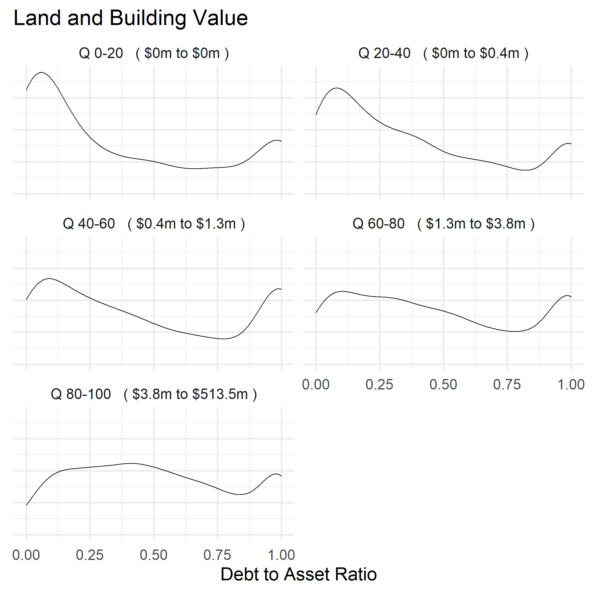
Save Metrics
core.dar <- select( core, ein, tax_pd, dar )
saveRDS( core.dar, "03-data-ratios/m-01-dept-to-asset-ratio.rds" )
write.csv( core.dar, "03-data-ratios/m-01-dept-to-asset-ratio.csv" )